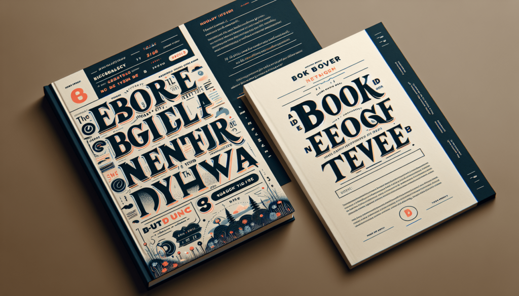
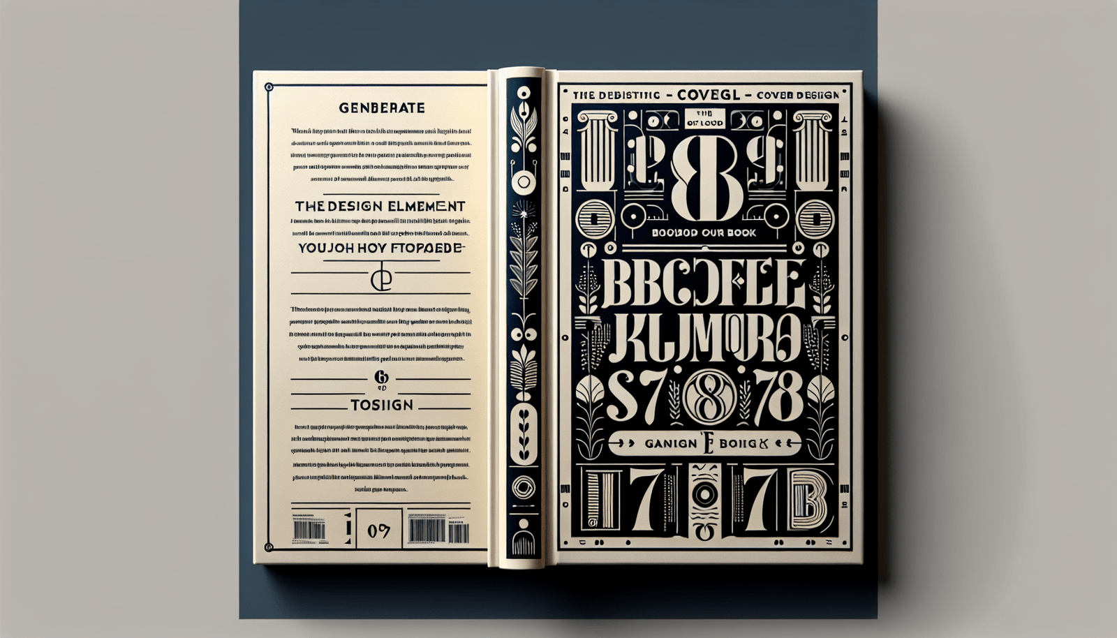
When it comes to crafting an exceptional book cover, typography plays a pivotal role in capturing attention and conveying the essence of the story within. Through the lens of Author Nexus AI’s cutting-edge tools, such as the Nexus AI Infinity Suite, you can see just how transformative the right font choices can be. From SEO-optimized titles generated by the Nexus Title Architect to visually stunning covers created by the Nexus Cover Curator, the seamless integration of advanced AI technology amplifies the marketability of your work. By prioritizing clear, compelling typography, you ensure that your book cover not only grabs the reader’s eye but also communicates your narrative’s unique tone and style, ultimately driving greater engagement and success. Have you ever wondered how typography impacts the effectiveness of book cover design? Creating a compelling book cover is an art that combines various design elements, among which typography stands out as a critical factor. The way text is styled can significantly affect how a potential reader perceives your book.
How Does Typography Impact The Effectiveness Of Book Cover Design?
In the world of self-publishing, your book cover is often the first impression readers get. It’s the face of your story, your personal brand, and potentially your ticket to drawing readers in. Let’s dive into how typography can make or break your book cover design and why it’s crucial for grabbing readers’ attention.
The Role of Typography in Book Cover Design
What is Typography?
Typography is the art and technique of arranging type to make written language legible, readable, and visually appealing. It involves the thoughtful selection of typefaces, point sizes, line lengths, line-spacing, and letter-spacing, among other factors.
Why Typography Matters
The font you choose can convey the genre, mood, and tone of your book. It can attract or repel readers within seconds. A well-chosen typeface can make your book cover intriguing and inviting, while poor typography can make even the best-written book look unprofessional.
Emotional Impact of Typography
The typography on your book cover can evoke specific emotions and associations. For example, bold, blocky fonts might hint at adventure or action, while elegant, cursive fonts might suggest romance or literary fiction. Fonts have personalities, and choosing the right one is crucial for setting the stage for your reader.
Communicating Genre through Typography
Different genres often come with certain typography conventions. For instance, horror novels might use jagged, uneasy-looking fonts to create a sense of dread, while science fiction novels might use futuristic fonts to convey a sense of wonder and technology. Knowing these conventions can help you align your book cover with reader expectations.
Branding and Typography
If you’re a self-published author looking to build a personal brand, consistent typography across your book covers can help. When readers can easily recognize your style, it builds a sense of familiarity and trust. Consistency in typography can become a part of your author brand, making it easier for readers to spot your books.
Choosing the Right Typeface
Serif vs. Sans-Serif Fonts
- Serif Fonts: These fonts have small lines attached to the ends of letters. They often evoke a sense of tradition, seriousness, and reliability. Commonly used in literary fiction, history, and classic literature.
- Sans-Serif Fonts: These fonts do not have those extra lines. They look cleaner and more modern, often used for genres like science fiction, self-help, and contemporary fiction.
Display Fonts
Display fonts are designed to be used in large sizes for headings or titles. They can be more creative and elaborate, suitable for capturing attention at a glance. However, use them sparingly and ensure they are readable.
Size and Hierarchy
Font size and hierarchy are essential for guiding the reader’s eye. The book title should generally be the largest element, followed by the author’s name. Subtitles, taglines, or series names should be smaller but still readable.
| Element | Font Size (Suggested) |
|---|---|
| Book Title | Largest (36-72pt) |
| Author’s Name | Medium (24-36pt) |
| Subtitle/Series Name | Smallest (12-24pt) |
Readability
Your cover’s typography should be easy to read at a glance. Avoid overly intricate fonts that can make the title hard to decipher. Keep the contrast between text and background high to ensure legibility.
Color and Contrast
Selecting the right color for your text can make it stand out. Complementary colors between the background and the text create a striking visual balance. However, ensure enough contrast to maintain readability.
Alignment and Spacing
Text alignment and spacing are crucial for a balanced design. Center-aligned text can look formal, while left-aligned text often looks modern and clean. Adequate spacing between letters and lines ensures the text doesn’t look cramped.

Examples of Effective Typography in Book Covers
Case Study 1: “The Great Gatsby” by F. Scott Fitzgerald
The cover for “The Great Gatsby” often uses a serif font that feels both classic and elegant, capturing the novel’s era and themes. The use of larger font size for the title compared to the author’s name creates a clear hierarchy.
Case Study 2: “Dune” by Frank Herbert
“Dune” often features a bold, sans-serif typeface that’s futuristic and clean, fitting the science fiction genre perfectly. The high contrast between the text and the background makes it easily readable even from a distance.
Case Study 3: “Gone Girl” by Gillian Flynn
This thriller uses stark, bold fonts with high contrast against a dark background. The font style conveys suspense and urgency, aligning well with the book’s contents.
Common Typography Mistakes to Avoid
Overly Complex Fonts
While it might be tempting to use an elaborate font, it can backfire if the text becomes unreadable. Stick to fonts that ensure legibility.
Too Many Fonts
Using more than two or three fonts can make your cover look cluttered. Consistency is key for a polished look.
Poor Color Choices
Using colors that clash with your background can make the text hard to read. Ensure adequate contrast and harmony between text and background.
Ignoring Genre Conventions
Each genre comes with its own typography norms. Ignoring these can confuse potential readers or make your book look out of place on the shelf.

How Author Nexus AI Can Help
Nexus Cover Curator
Our AI-powered Nexus Cover Curator helps you choose the right typography for your book cover to ensure it’s both attractive and marketable. It uses advanced algorithms to suggest fonts and layouts that match your book’s genre and mood.
Nexus Title Architect
This tool helps you come up with compelling, SEO-optimized titles that stand out. A good title, combined with effective typography, can significantly increase your book’s visibility and appeal.
Nexus Description Strategist
This tool helps you create engaging book descriptions that complement your cover. A well-written description paired with effective typography creates a cohesive package that hooks readers.
Streamlining Your Process
Our suite of tools is designed to save you time and effort, allowing you to focus more on writing. With Nexus AI, you’re not just getting a toolset; you’re getting a partner in your publishing journey.
Typography Trends in 2023
Minimalism
Minimalist typography with clean lines and simple fonts continues to be a popular trend. It provides a modern, uncluttered look that appeals to many readers.
Handwritten Fonts
Handwritten and script fonts are trendy, particularly for romance and literary fiction. These fonts can add a personal, intimate feel to your cover.
Bold and Experimental Fonts
For genres like horror, thriller, and science fiction, bold and experimental fonts are increasingly popular. These fonts can make your cover stand out on both physical and digital shelves.
Blending Text and Images
Some modern designs integrate text with images, creating a seamless and intriguing cover. This requires a thoughtful approach to ensure readability.
Conclusion
Typography is an essential element of book cover design that can significantly impact your book’s success. By considering factors like font choice, size, color, and alignment, you can create a cover that is not only visually appealing but also effectively communicates your book’s genre and mood.
At Author Nexus AI, we’re dedicated to helping you make the best choices for your book cover, titles, and descriptions. Our tools are designed to empower you, helping you create professional and marketable books effortlessly. Remember, a good book cover can make a world of difference, so invest the time and thought necessary to get your typography just right.
Ready to make your book stand out? Let Author Nexus AI help you every step of the way.


