Imagine you’re about to create a book cover that not only captures attention but also tells a story at a glance. In “What Are The Essential Graphic Design Principles For Crafting Eye-Catching Covers?” you’ll discover the foundational concepts every designer should know to make captivating, stand-out covers. This guide takes you through the art of balance, contrast, hierarchy, alignment, and more—ensuring your designs are both visually appealing and highly effective. Dive in and elevate your design game with principles that turn ordinary covers into extraordinary visual experiences.
Have you ever wondered what makes a book, magazine, or album cover so irresistibly eye-catching that you can’t help but pick it up? Crafting visually appealing covers involves more than just slapping on some pretty images and funky fonts. The magic lies in mastering certain graphic design principles tailored to engage the viewer right from the start.
In this article, we’ll delve into the essential graphic design principles you need to know for creating captivating covers. Whether you’re a seasoned designer or a newbie, there’s always something new to learn. So, let’s dive in!
Understanding Graphic Design Principles
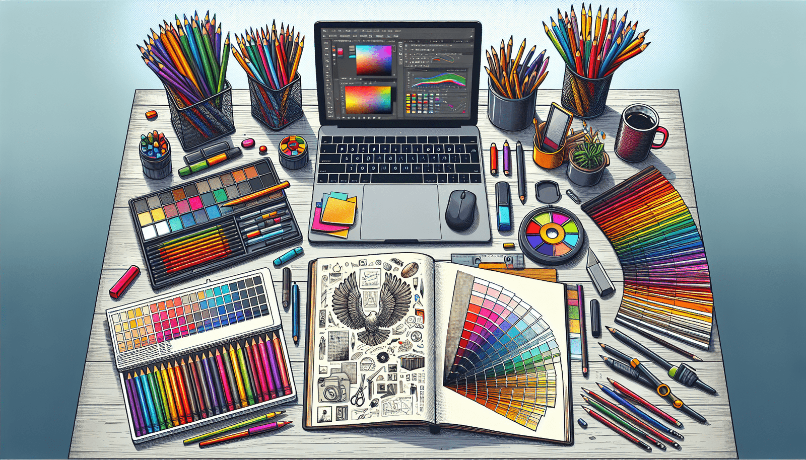
Graphic design principles are guidelines that help you create layouts that are both functional and aesthetically pleasing. By understanding and applying these principles, you’ll be able to craft covers that not only look good but also communicate your message effectively.
Balance
Balance refers to the distribution of visual elements in a design. It ensures that no part of your cover feels too heavy or too light. This can be achieved through symmetrical or asymmetrical arrangements.
Types of Balance
| Type | Description |
|---|---|
| Symmetrical | Equal weight on both sides of a central axis. It’s more formal and can create a serene, orderly feeling. |
| Asymmetrical | Unequal weight on each side but still balanced through contrast, color, or size. It’s more dynamic and interesting. |
Contrast
Contrast is the difference between two or more elements in a design. It helps to highlight key areas and keeps the design engaging by making each element stand out.
Implementation of Contrast
- Color: Use colors that stand out from each other.
- Size: Varying sizes of fonts and graphics can create focus and emphasis.
- Font: Different font styles can add visual interest.
Alignment
Alignment is the arrangement of elements in a design to ensure they are evenly distributed. This creates a cohesive look that guides the viewer’s eye across the cover.
Types of Alignment
| Type | Description |
|---|---|
| Edge | Aligning elements to the left, right, top, or bottom edges of the design. |
| Center | Aligning elements to a central point, often used to create a formal and balanced look. |
| Visual | Aligning elements along a visual line that doesn’t necessarily conform to the edges or center of the design. |
Repetition
Repetition involves using the same or similar elements throughout the design to create unity. This can be done through colors, shapes, fonts, and other design elements.
Benefits of Repetition
- Creates Consistency: Helps in creating a cohesive design.
- Aids Recognition: Helps viewers quickly recognize and understand recurring elements or themes.
Proximity
Proximity refers to how close or far apart elements are from each other. Grouping related items together and separating unrelated ones enhances clarity and organization.
Practical Tips for Proximity
- Group Related Items: This helps in creating sections.
- Use Space Wisely: Don’t overcrowd; leave some breathing room between elements.
Hierarchy
Hierarchy guides the viewer’s eye to the most important elements first and then down the importance ladder. This is achieved by varying sizes, colors, and placements of different elements.
Elements of Hierarchy
- Size: Larger elements are usually seen first.
- Color: Brighter colors can draw attention.
- Position: Elements placed at the top or center are often noticed first.
Applying Principles to Craft Covers
Now that we’ve covered the key graphic design principles, it’s time to apply them to your cover designs.
Step 1: Define Your Objective
What is the focus of your cover? Is it to convey a mood, depict a theme, or highlight a particular item or person? Your objective will guide your design choices.
Step 2: Choose Your Elements Wisely
Consider the following:
- Imagery: Choose images that resonate with your theme.
- Typography: The font should align with the tone of the cover.
- Color Scheme: Select colors that convey the right mood and create contrast.
Step 3: Create a Mockup
Start with a rough sketch or digital mockup. Place your elements according to the principles of balance, alignment, and proximity. Ensure that your hierarchical elements stand out.
Step 4: Review and Refine
Look at your design with fresh eyes. Does it achieve your objective? Are the key elements prominent? Does it look balanced? Make adjustments as needed.
Step 5: Seek Feedback
Show your design to others. Sometimes, a different perspective can point out areas for improvement that you might have missed.
Case Studies of Effective Covers
To bring these principles to life, let’s look at some case studies of effective cover designs.
Example 1: “The Great Gatsby” by F. Scott Fitzgerald
This cover uses a symmetrical balance, with the striking illustration of eyes and lips creating a focal point. The contrast in color between the deep blue background and the bright yellow text draws immediate attention.
Example 2: “To Kill a Mockingbird” by Harper Lee
The design employs an asymmetrical balance but uses repetition and proximity effectively. The use of earthy colors and natural imagery conveys the book’s themes, while the large font size of the title creates a clear hierarchy.
Example 3: “Abbey Road” by The Beatles
This iconic album cover uses an asymmetrical balance, leading lines, and proximity to draw attention to the band members. The zebra crossing serves as a natural line guiding your eyes to the focal points.
Advanced Tips for Stunning Cover Designs
Once you’ve mastered the basic principles, there are a few advanced techniques that can make your covers even more captivating.
Use of Negative Space
Negative space, or the empty areas around and between the elements, can significantly enhance your design by creating focus and emphasis.
Mixed Media
Combining digital and traditional mediums can add an interesting texture and depth to your cover. For example, using a hand-drawn illustration along with digital typography can create a unique look.
Interactive Elements
In some contexts, adding interactive elements like QR codes or augmented reality can provide a modern twist and engage viewers further.
Feedback Loops
Establish a feedback loop with your audience. Collect data on what designs resonate the most and adapt your future covers based on this input.
Final Thoughts
Creating eye-catching covers is both an art and a science. By understanding and applying these essential graphic design principles, you’ll be well on your way to crafting covers that not only capture attention but also tell a compelling story. So go ahead, let your creativity soar, and make your covers stand out in a crowded marketplace!