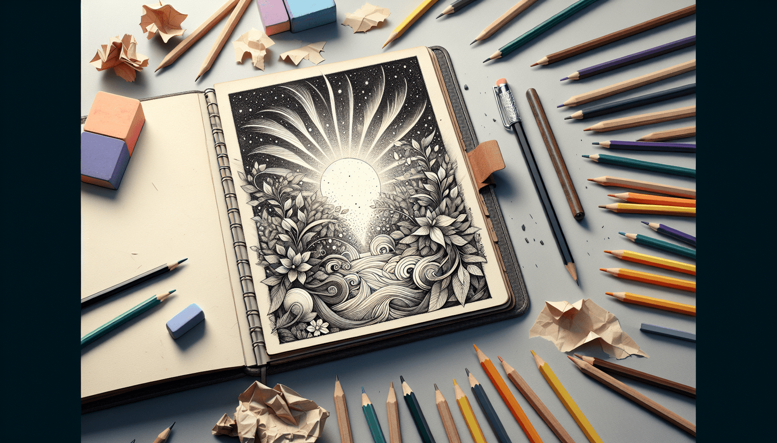
Welcome to the enchanting world of Book Covers, where each visual element whispers secrets designed to captivate your curiosity and draw you into the story before you’ve even read the first word. In “What Secrets Do Best-Selling Book Covers Hold for Captivating Readers?”, you’ll uncover the magic behind the colors, fonts, and images that best-selling authors and designers use to grab your attention. You’ll learn how the perfect cover can speak volumes, inviting you to explore new worlds, meet unforgettable characters, and embark on thrilling adventures. Ready to find out what makes a book cover truly irresistible? Let’s dive in!
Have you ever walked through a bookstore and found yourself inexplicably drawn to certain book covers? It’s almost as if they whisper secrets, urging you to pick them up and delve into their pages. But what lies behind these magnetic designs? In this article, you’ll uncover the secrets best-selling book covers hold for captivating readers just like you.
The Power of First Impressions
Judging a Book by Its Cover
Despite the old adage, you do judge a book by its cover. And that’s okay! The cover is the first thing you see, and it plays a crucial role in your decision-making process. A well-designed cover can entice you, while a poorly designed one can repel you.
Visual Hierarchy: What Grabs Your Attention First
Clever designers use visual hierarchy to guide your eye across the cover. They determine what you see first, second, and third. Typically, your eye is drawn to the main image, then the title, and finally the author’s name.
Here’s a quick example of visual hierarchy:
| Element | Importance Level | Why It Matters |
|---|---|---|
| Main Image | High | Captures initial attention, sets the tone |
| Book Title | Medium | Provides context and anchors the main image |
| Author’s Name | Low | Adds credibility but is often secondary |
Color Psychology: Speaking to Your Emotions
The Emotional Palette
Color isn’t just about aesthetics—it’s about emotion. Different colors evoke different feelings and responses from you.
- Red: Urgency, excitement
- Blue: Calm, trust
- Green: Growth, tranquility
- Yellow: Cheerfulness, attention
The colors chosen for a book cover aim to evoke specific emotional responses, aligning with the book’s genre and tone.
Matching Colors to Genres
Genre often dictates color choices. Thriller books, for instance, may use dark, ominous colors to set a suspenseful mood, while romantic novels may use softer, pastel shades to evoke warmth and affection.
Typography: The Unspoken Language
Font Choices Matter
Typography, the style and appearance of printed text, speaks volumes about a book. Serif fonts (like Times New Roman) often convey tradition and reliability, while sans-serif fonts (like Arial) feel modern and clean.
The Title’s Font: An Indicator of Genre
The font used for the title can signal the book’s genre. For example, an elegant, cursive font might hint at a romance novel, whereas a bold, blocky font might suggest adventure or sci-fi.
Collaborating Elements
Typography doesn’t work in isolation. It’s carefully paired with other design elements to create a cohesive and compelling visual message.
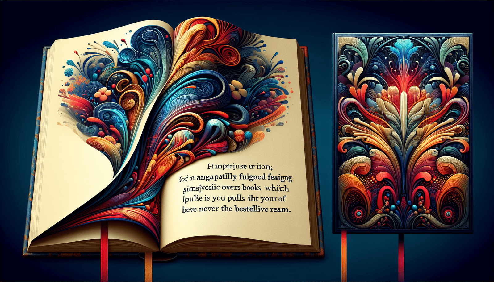
Imagery: More Than Just a Pretty Picture
Symbolism and Metaphors
Imagery on book covers isn’t just decorative—it’s symbolic. It can offer hints about the story, its themes, or its characters.
Real vs. Abstract
Some covers use realistic images, like photographs or detailed illustrations, to convey a sense of realism. Others opt for abstract designs that evoke feelings or themes indirectly.
Balancing Act
Finding the right balance between too much and too little imagery is crucial. Overloading with images can overwhelm you, whereas too little may fail to grab your attention.
The Role of Trends and Market Research
Keeping Up With Trends
Just like fashion, book cover designs evolve with trends. What’s hot today may not be tomorrow. Publishers keep an eye on these shifts to stay relevant.
Data-Driven Decisions
Market research plays a significant role in cover design. By understanding what types of covers attract specific demographics, designers can create more effective designs.
The Impact of Author Branding
Recognizable Styles
If an author is well-known, their name alone can sell books. Their covers might follow a recognizable pattern or style that fans immediately associate with them.
Series Consistency
For books in a series, consistency is key. A cohesive look across all covers helps you easily identify books that belong together.
Case Studies: Anatomy of Best-Selling Covers
“The Da Vinci Code” by Dan Brown
- Color Scheme: Dark, mysterious
- Typography: Bold, serif fonts hinting at historical significance
- Imagery: Iconic symbols hinting at the plot’s central themes
“Harry Potter” Series by J.K. Rowling
- Color Scheme: Bright and magical
- Typography: Whimsical, inviting fonts
- Imagery: Realistic yet fantastical elements
Both these covers have succeeded in grabbing attention and conveying the essence of the stories within.
How You Can Design an Effective Cover
Know Your Audience
Understanding your target audience is the first step. What appeals to them? What emotions are you trying to evoke?
Collaborate With Professionals
Professional designers bring immense value with their expertise in color theory, typography, and layout. Collaboration can lead to a cover that is not only beautiful but also strategically effective.
Test and Refine
Don’t be afraid to test different designs and gather feedback. Many best-selling covers go through multiple iterations before hitting the shelves.
The Future of Book Covers
Digital Implications
With the rise of eBooks, cover design is adapting. Smaller thumbnail images mean that covers need to be impactful even at a reduced size.
Interactive and Augmented Reality
Technology is paving the way for more interactive book covers that can engage you in new and exciting ways, such as augmented reality elements.
Conclusion: The Art and Science of Book Covers
In conclusion, best-selling book covers are a blend of art and science. They utilize design principles and psychological insights to captivate you, creating a visual allure that’s hard to resist. From color psychology and typography to imagery and market trends, every element works together to draw you in and make that crucial first impression.
Next time you find yourself irresistibly drawn to a book cover, remember the careful thought and strategy behind it. Who knows? Armed with this knowledge, you might even spot the next best-seller on the shelf before the rest of the world does.